I was able to take an SLR out from Uni over the Christmas holidays, this was the best christmas gift I received (even though it was only mine for a brief period!). I have decided I definitely need to start saving up for one of these beauts, I didn't realise how much I would use it. This photo is just an example of how I explored and found new techniques.
Some deliciously decorated cupcakes from my little sisters school Christmas Fete. The colours are gorgeous and the snowmen on top make them irresistible, I had to buy four.......oops.
The photos below show my designs for 'The XX' record sleeves. Once I had my designs I made prototypes to see what they looked like as products. I am really happy with the way they have turned out, although I am planning on changing them slightly, and I may even play around with new images I have taken on my pinhole camera.
I really wanted to keep the records in a box (shown below), but my tutors think that boxing them up is restricting on them and doesn't show them to their full potential, I may have to re-think the packaging.
If you have been watching the recent American television drama series 'TrueBlood', you will know just how extraordinary the opening credits are. The Emmy-nominated title sequence shows clips of usual 'goings-on' in the deep South in which the drama is set. The music played ontop of the sequence is "Bad Things" by Jace Everett, the music superviser for the series said he wanted something that sounded "swampy, bluesy and spooky".
'In editing the opening, Digital Kitchen wanted to express how "religious fanaticism" and "sexual energy" could corrupt humans and make them animalistic. Accordingly, several frames of some shots were cut to give movements a jittery feel, while other shots were simply played back very slowly. Individual frames were also splattered with drops of blood.'
Below are some screen shots from the opening, it shows just how well shot it was, as each picture works as a single photo.
Ideas for covers... Below are scans from my sketchbook for Brief 6, they show some sketches I have done as ideas for the record covers and designs for the leaflet that would come inside.
Firstly there's the front cover I have previously designed using the pin-hole images I took earlier in the project. You can see I have added an 'xx' to the front in a very simple way. The 'xx' would be cut-out of the page. I didn't want the front of the record to look crowded or busy so I kept it very muted. Next to the front cover is an idea for the back of the leaflet that goes inside the record case. It would be the side of the leaflet that is facing up once you open the CD case. It might be quite hard to work out, but I have put the word 'Islands' (one of their song names' in big letters across the front, slightly hidden by an invisible 'X'. I have doubts about this design as it's quite difficult to read.
Next are my designs for the inside spread of the leaflet. On the first page would be a description of the band; who they are, what music the play, their influences etc. I wanted to carry the 'X' theme throughout the whole record, so I made the lettering of the description to form a big 'X' on the page. On the opposite side are the lyrics to the song, keeping it very simple it would be written in black on a white background and a simple font would be used. I really like these two designs and will seriously cnosider using them in my final product.
Below are some more ideas for the inside of the leaflet. As you can see, this is more focused on 'cutting-out' the 'xx' to make the visual message more obvious. I don't particularly like this design much.
I think this logo (below) works really well, it is made up to two X's, but at first glance looks like one big X. It's a very simple design in monochrome and looks, delicate, yet harsh.
I have been compiling a list of my favourite opening sequences from films as research for my project, here are a few...
The famous crane shot from Orson Welles' 1958 film, 'Touch of Evil.'
Stunning opening sequence, so cleverly done.
Apocalypse Now opening along with The Doors "The End" playing.
Spine tinglingly creepy opening of The Shining
Ed Wood, the sequence is a pastiche of the opening titles for real Ed Wood films including Bride of the Monster (1955) and the infamous Plan 9 From Outer Space (1959).
My research into famous album covers including, The Velvet Underground - Andy Warhol Banana Print, The Libertines, Iron Maiden, Joy Division, The Clash and Nirvana.
I have been so incredibly busy recently doing my other projects as the deadlines are looming, but I haven't forgotten about you!! I'm back now and will desperately try to update you every night with immensely interesting posts!
This afternoon Ms. Klingels came to Uni to give a talk on her work and life so far. I had been really excited about Izzie coming in to talk to us I had been a previous fan of her work and was intrigued to find out the thought process to specific pieces.
I'll tell you a bit about her shall I??
After graduating Chelsea school of Art, Izzie founded a company called 'Lazy Eye' working with film and video, creating and designing live shows and directing promos for bands including Death In Vegas and Beth Orton.
Izzie has and still is a main player in producing videos for TOPSHOP/TOPMAN nad Calvin Klein. Below is a film she made for TOPMAN called 'MAGIC BOX'. The film was made in place for a Catwalk show, as TOPMAN felt a catwalk show was too feminine. They created an environment to show the film in which you would stand in a room where the walls were made of screens and the film would be shown on the screens therefore surrounding you.
"Norman Mclaren was a great inspiration for this project" Izzie told us. You can tell by watching the film that Mclaren was an inspiration, specifically because of the stop-motion imagery used.
Another interesting Show Izzie created for long-term client TOPMAN was an Ice themed catwalk show. Along the edge of the runway was real ice and as a backdrop Izzie used a short film of a particuarly saturated sunrise. The inspiration behind this show was that of Len Lye (A Colour Box)...
and Work by Stan Brakhage...
(I particuarly enjoyed looking into Len Lye and Stan Brakhage's work as my Imaging work is based around their films! you know what they say....two birds!)
In 2001, Izzie co-founded a club called 'Hey Ladies' which was a club created for and by females. It was at this time that Izzie started to get into Illustration, she would Illustrate the fanzine they used to promote 'Hey Ladies'.
Behind the whole venture was an image, this image was Olympia by Manet in the 1860s. This was the first modern portrayal of a woman and at the time, people were appalled by it, they thought it was too sexual and confrontational. Nude women were usually either a kind of goddess or a representation of fertility or something of the sort, but this woman was obviously a prostitute.
What the founders of 'Hey Ladies' liked most about this image was the confidence the woman exudes. She stares straight at you like she has no shame or embarrassment. An interesting fact about this painting is that the model in the painting was a painter in her own right.
The great thing about creating a fanzine as a promotional tool is that people are able to read it easily, they can read it on the bus, at lunch or at any moment the have free. Izzie told us that 'Hey Ladies' shaped her style of illustration, made her choose to work with pen & ink, embracing colour, collage and digital media as her commercial commissions grew, and set her on her course. This played a big part in making her the illustrator she is today.
'Hey Ladies' ended when everyone who ran it became busy with other projects, but ran a workshop at the V&A as a final goodbye to the company.
After discovering her new found love for illustration, Izzie started focusing her attention on it more.
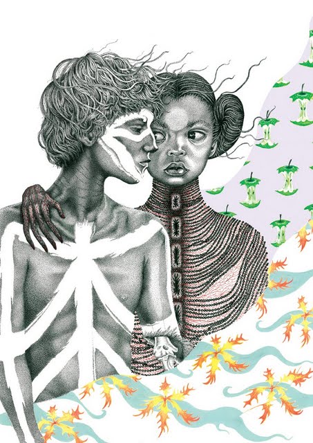
Here are some of her wonderful illustrations...
Class was amazing today! We sat in our classroom listening to music and drawing along to it. It was really interesting to see everyones different takes on the same song, also everyone was using different materials to draw with, so the outcomes very so varied. Here are some examples of mine, can you identify the beat in any of them?
My course at university requires me to keep a personal journal throughout my studies. Using a blog to communicate my thoughts and workings seemed the most creative and exciting way to me.